

Helping all students become more empathetic, critical thinkers is the crux of everything we do. And anything that hinders that learning? Well, it keeps us up at night. Our latest product update, which we launched over the weekend, addresses a user-experience issue with our post-reading comprehension checks.
There has been some confusion regarding the selection of multiple choice answers versus results on our automated assessments. Our Support and Success teams were hearing reports of misleading colors, symbols, and mysterious changing answers. With this feedback, our team set out to get to the heart of the problem and come up with a better way to communicate score results with less confusion.
So how did we tackle this overhaul? Robin Schaaf, our Senior UX Engineer, first set out to identify the problem. She spent many days (and nights) trying to replicate the issue, testing every device and browser combination and simulating network issues. While tracking lessons in our database and looking for patterns, Robin hypothesized several different scenarios:
“Was it just during certain parts of the day, indicating higher traffic on our servers? Was it happening just on certain networks? Certain lessons? Or through devices that were shared by multiple students? Did it happen when students were trying to complete the tests too quickly? Or if they had selected a single answer and changed it to something different?”
A sneaking suspicion that an this was user-interface issue was confirmed when Robin sent a screenshot of a test to the team. After convincing herself that she had successfully replicated the scenario (using an iPad on a 2G network), one team member pointed out that she had simply misread it. She describes her turning point saying, “if I could so easily misread the UI, then what's the chance that a student could?”
Shortly after this revelation, the team began usability research and considered interfaces that ThinkCERCA users are familiar with like PARCC. A few prototypes later, we had found a winning interface!
Before making the redesign official, we wanted to test it in a ThinkCERCA school. Matthew Decarlo, our Junior Software Engineer, and Robin headed to a local Chicago school to test their solution. A lesson was assigned to the class, as well as Robin and Matthew. Students were instructed to write down answers; if this was a network or hardware issue, we needed proof.
As it turns out, there were no technical issues, simply confusion with the interface. When students believed their answers had changed, they were asked to check their written records. Once prompted to look more closely, it became obvious. After the lesson, students had the opportunity to give feedback about their user experience and suggestions for improvement.The result of all this testing lead to a redesign that includes clearer color coordination, an opportunity to check answers, and an extra step to confirm submission. Let’s take a look at this redesign from a student’s perspective. And for good measure, we’ve also included a few classroom tips below to ensure your students won’t run into these issues anymore.
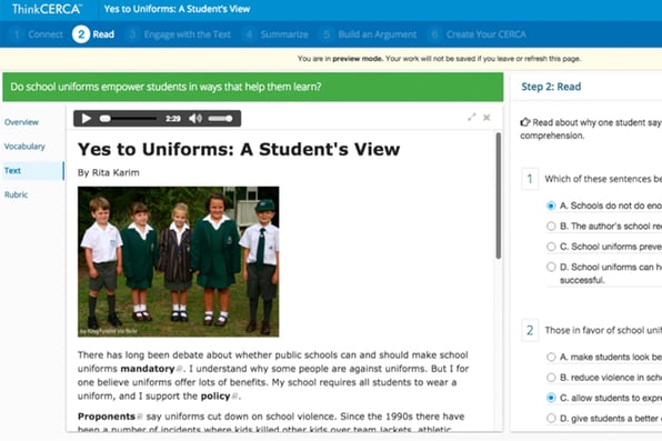
It’s starts off business as usual
Student interaction with the automated comprehension check has not changed. Students will read the text and select answers to multiple choice questions.
When students click submit…
A dialog box will pop up asking students to review their submission. Students have the opportunity to reread and confirm answers.
TIP: Set boundaries for student performance. If a student’s score is below 80 percent, they are required to identify the correct answer and provide a rationale. Allow students to work with a peer. Not only is this a healthy practice for any blended learning setting, students become more aware and accountable for their work.
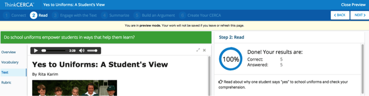
At a glance…
Students will see a visual representation of their results as well as a breakdown of their score by items correct and answered.
If an answer is correct...
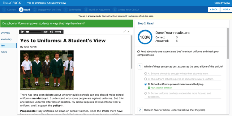
The student’s response to the question appears in bold. A correct answer is confirmed by a check mark with the words “Your Answer- Correct” in green.
If an answer is incorrect…
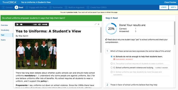
The student’s response to the question appears in bold. An incorrect answer is indicated by an “x” with the words “Your Answer- Incorrect” in red. The correct answer to the question is marked.
TIP: Explicitly point out updates as you review with students. Student responses will always appear in bold text. Confirmation of a right or wrong answer will appear in green or red, respectively, below.
We appreciate all the candid feedback we received as we worked to fix this issue. After several designs and hours with students (Robin’s son may or may not have been subjected to a QuickCERCA lesson or two), we’re hoping students and teachers alike will be less concerned with mysteriously changing answers.
Your questions, comments, and suggestions fuel our constant improvement. Tell us what you think about this latest update and keep the feedback coming!